Why this site looks the way it does
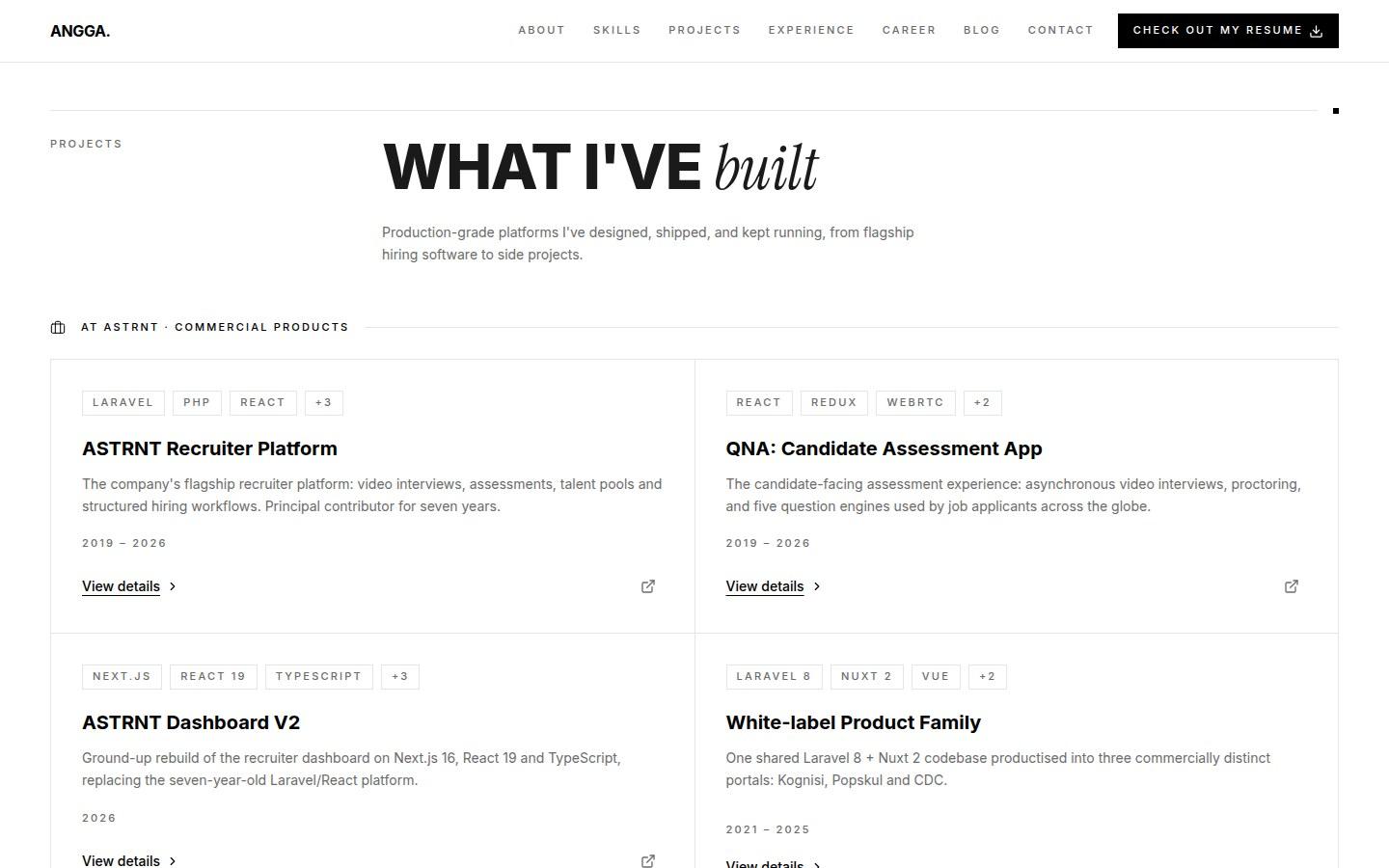
I rebuilt this portfolio around a monochrome, editorial system. These are the decisions behind it, including two Tailwind v4 behaviours that did most of the work and one screenshot that lied to me.
- Design systems
- Tailwind
- Next.js
- Accessibility
The previous version of this site looked like a lot of developer portfolios: a navy and purple palette, soft rounded cards, drop shadows, gradient headings, and two blurred circles floating behind the hero. None of it was wrong. It was just generic, and generic is expensive when the page has about ten seconds to say something specific.
So I rebuilt it around a single idea: one black, one white, hairline rules, and typography doing all of the work. This post is the reasoning, and the parts that turned out to be more interesting than expected.


Deciding what to aim at
I picked a reference site and studied it properly rather than in passing. The useful finding was that it is not uniformly dark. The homepage opens on a black hero and everything after it is white. That one observation settled the structure of my own homepage, because it meant the black was a statement at the top rather than a theme.
The other finding was how little decoration the reference used. No rounded corners, no shadows, no gradients. Every separation is a one pixel line. Emphasis comes entirely from type: a heavy uppercase display face for statements, an italic serif for the words that carry the meaning, and a tiny wide-tracked uppercase label for everything structural.
One decision that removed about ninety edits
My first assumption was that going monochrome meant touching every component. Roughly 167 class references pointed at colour tokens and about 114 were light and dark pairs. That is a large, error-prone sweep.
The better move was to change the tokens instead and leave the components alone. Tailwind v4 keeps its design tokens in CSS, so repointing the brand ramp to greys made the entire site monochrome in one file:
@theme inline {
  --color-brand-50:  #f5f5f5;
  --color-brand-600: #000000;
  --color-brand-950: #000000;
  --color-brand-primary: #000000;
  --color-brand-accent:  #000000;
}The same trick reaches further than colour. Corner radius, shadow and blur are token-driven too, so the whole site lost its soft edges from one block. Worth knowing: rounded-full is not token-driven, because it compiles to a calc that resolves to a very large number. Deliberate circles survive, which was what I wanted, but it also means a stray pill-shaped tag will quietly outlive the restyle.
@theme {
  --radius-sm: 0px;
  --radius-md: 0px;
  --radius-lg: 0px;
  --radius-xl: 0px;
  --radius-2xl: 0px;

  --shadow-sm: 0 0 #0000;
  --shadow-md: 0 0 #0000;
  --shadow-lg: 0 0 #0000;
}
Removing dark mode in one line
The old site followed the operating system and switched itself to dark automatically. That had to go, and not only for taste: an explicitly black hero cannot survive a dark mode that resolves surfaces to white. Two themes and one designed black section are not compatible.
Deleting the dark variants from a hundred places was the obvious approach. The cheaper one was to neuter the variant itself so those classes never match anything:
@custom-variant dark (&:where(.dark, .dark *));.dark is never set anywhere, so every dark: twin is inert.That buys time. The dead classes then get deleted while the component is open for other reasons, instead of in one risky pass. I have since removed all of them, but they were harmless for as long as they existed.
The font that was downloaded but never used
This one cost me an hour. The site loaded Inter through the framework font loader, which self-hosts it and gives the family a hashed name. My theme declared the sans stack as the literal string "Inter".
The inline keyword on a theme block inlines resolved values rather than referencing them. So the utility compiled down to a literal font-family of Inter, which never matched the hashed name the loader had actually installed. The font file was downloaded on every page load and used on none of them. Everything fell back to the system sans, which looks close enough that nothing appears broken.
The fix is to point the token at the variable the loader exposes, so the reference stays a reference:
--font-sans: "Inter", ui-sans-serif, system-ui, sans-serif;

/* After: the variable, which resolves to the loaded face. */
--font-sans: var(--font-inter), ui-sans-serif, system-ui, sans-serif;Measuring instead of trusting the picture
Partway through I took a screenshot at a phone width and the layout looked broken. Headline text ran off the right edge, the type was far too large for the screen, and it looked like a horizontal overflow bug.
It was not. The screenshot tool was not applying the window size to page layout, so the page had laid itself out at roughly 886 pixels wide and the image had captured the left 390 of it. I had been about to redesign a layout that was already correct.
So I stopped screenshotting to check layout and started measuring it. The replacement script reports the real viewport, the document scroll width, the rendered font size, and any element whose box escapes the viewport, at several widths, from a real browser:
scrollWidth > clientWidth   // is anything overflowing?
getBoundingClientRect()     // where is the box, really?
getComputedStyle(h1).fontSize  // did clamp() resolve as intended?
The same measurement caught a genuine bug the eye had missed. The hero is anchored to the bottom of the first screen, and on a phone its content comes to about 1335 pixels against a 900 pixel viewport. The four proof numbers were stacking into four rows. Two columns on small screens and one row above the breakpoint brought it down to 1183. Still taller than one screen on a phone, which is fine, but no longer absurd.
What the austere version has to get right
A monochrome design has no colour left to signal with, which moves weight onto the things colour was quietly covering for:
- Focus rings. There is no accent colour to lean on, so keyboard focus is a two pixel outline, black on white and white on the black hero. It has to be visible on both.
- Links inside prose. With no colour shift available, an inline link is underlined. That is not a style preference, it is the only affordance left.
- Text selection. The default selection would have been invisible against the black hero, so selection colours are set per surface.
- Motion. Several sections start at zero opacity and rely on an animation to become visible. Anyone who has asked their system to reduce motion would have landed on a blank page, so reduced motion resolves those elements to their finished state.
What I would keep
The token-first approach. Changing what the tokens mean, rather than what the components say, turned a large risky refactor into a small safe one, and the same lever reached radius, shadow and blur that I had not expected it to touch.
And measuring rather than eyeballing. Two of the decisions in this post came from a number in a terminal, not from looking at the page, and one of them was a bug I had been looking straight past.